Intro to Singularity
These slides, references, and examples are on GitHub:
tsmith512.github.io/intro-to-singularity
Taylor Smith
Designer / Frontend Dev
@ Four Kitchens
tsmith512 on
Github,
Twitter,
LinkedIn,
Drupal.org,
Instagram, and
sometimes seen at Four Kitchens.
Prerequisites
We're talking Sass and grids, so I assume you:
- Know Sass!
Ruby or Node! Compass is not a dependency. - Extend a project with Bundler (Ruby) or npm (Node).
- Have used at least one grid system or framework like 960, Bootstrap, Foundation, or Susy 1.x
-
Know why to
use the
border-boxbox sizing mode and do so
Singularity will:
-
Meet your needs:
Create your own grid system, just the way you want it. -
Tool won’t dictate outcome:
You’ve probably never really needed 12 columns, you just needed fractions. -
Free of presentational classes:
Because.push-3,.col-md-6, or.large-8don’t mean anything; it’s litter. -
Allow different types of grids:
Symmetric (equal-width column), Asymmetric (varied-width column) grids, and more. -
Be powerfully responsive:
Change your layouts when coupled with Breakpoint -
Visual order ≠ source order:
Awesomeness which cannot be summed in a sentence fragment. -
Example case:
Aunt Flossie’s Résumé
Today will be an overview
Singularity is immensely flexible. There are things I cannot cover in one presentation, and I'm still exploring all the possibilities with this tool. Play with it, read the docs, experiment, and ask for help.
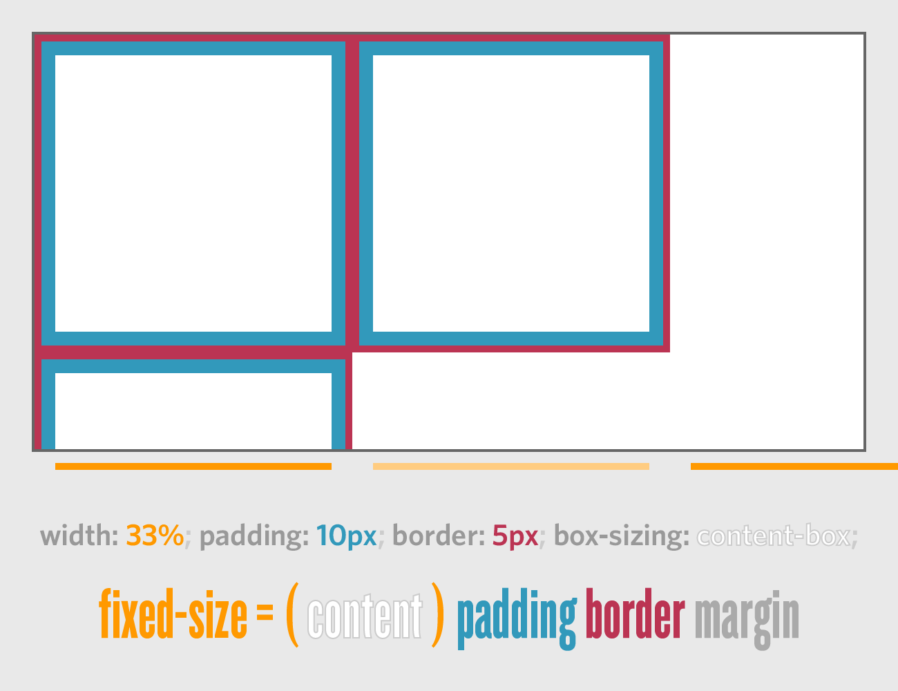
Review: The Box Model
Box Sizing
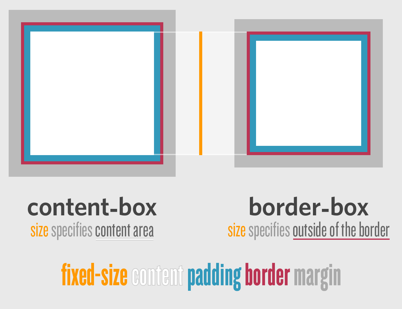
Content Box
Has this ever happened to you?
Border Box
Is this what you wanted?
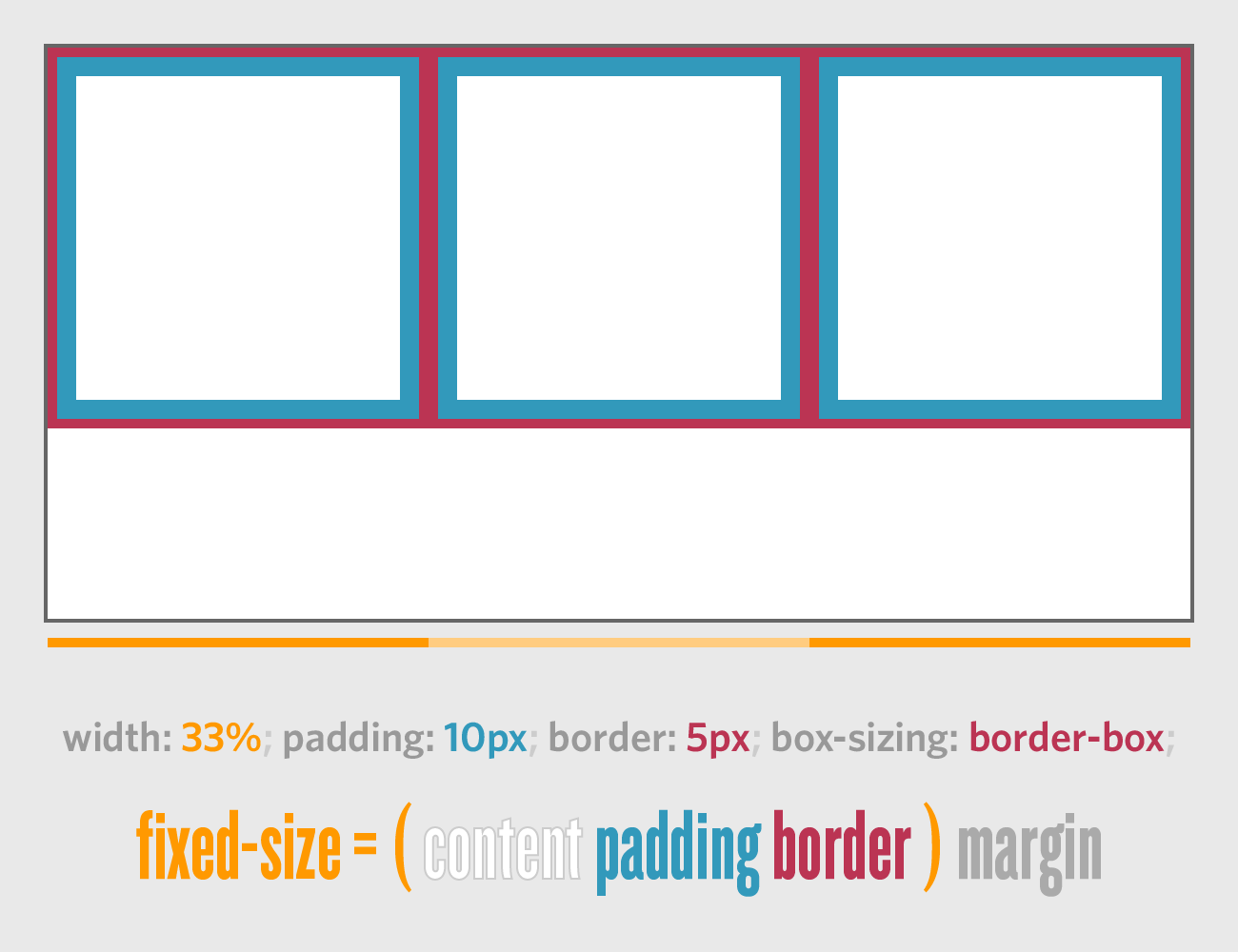
¡Ojo!
Singularity requires box-sizing: border-box;
// SCSS:
*, *:before, *:after {
  @include box-sizing('border-box');
}

/* Compiled CSS */
*, *:before, *:after {
  -moz-box-sizing: border-box;
  -webkit-box-sizing: border-box;
  box-sizing: border-box;
}
Review: What was 960?
Just a twelve column grid
Others Include: Bootstrap, Foundation, YUI Grids…
Why so many 12-column grids?
Because math.
- 12 ÷ 2 = 6
- 12 ÷ 3 = 4
- 12 ÷ 4 = 3
- 12 ÷ 6 = 2
- 12 ÷ 12 = 1
Twelve is a least common multiple for the number of columns you actually needed. How often did you actually use 12 even columns?
(If you did, have you considered Flexbox?)
What is Singularity?
Just another way to make columns and gutters.
But you can futz with ’em.
From 960/Whatever to Singularity
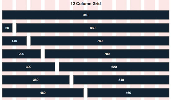
Image from Six Revisions: The 960 Grid System Made Easy.
You can build this in Singularity, if you want. (Don’t.)
That’s all, folks!
Twitter Bootstrap’s Grid
@include add-grid(12);
@include add-gutter(1/3);
// ^^ Include once in a config partial or at the top of a Sass file above styles.
//    THIS IS A GLOBAL CALL.
.container { @include clearfix; }
// ^^ Just clearfix your container, no need to add more grid calls
Add Grid is Global
// Don't do this.
@include add-grid(10);
.container-A { @include add-grid(12); }
.container-B { @include add-grid(7); }
Replacing your global grid can cause maintainability issues because
the grid isn't scoped to that selector or Sass code block. If you do
need to do this, look at
the layout mixin or overrides.
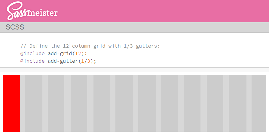
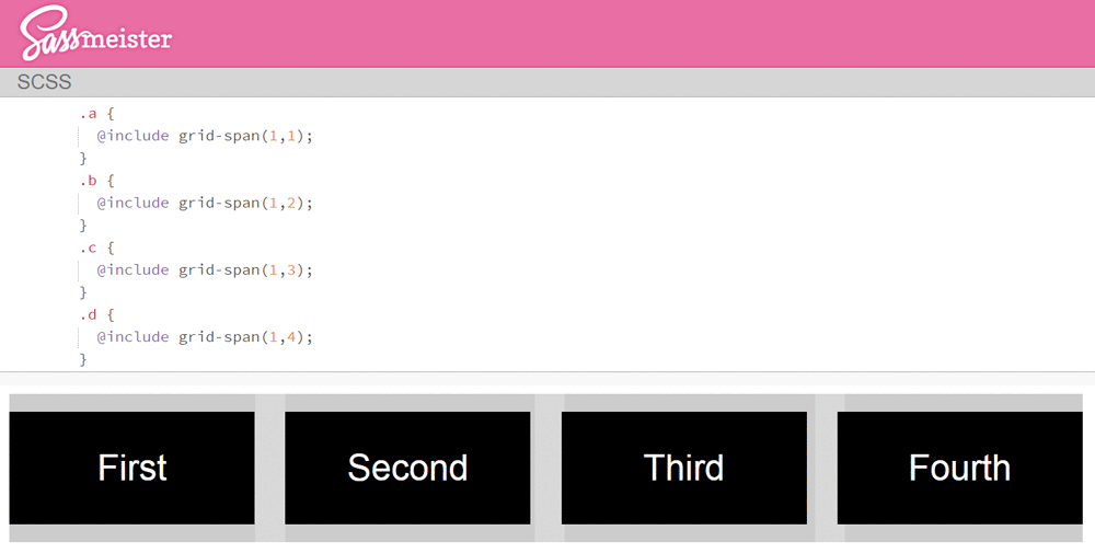
Spanning the 12-column grid:
Include @include grid-span();
to put an element in a column.
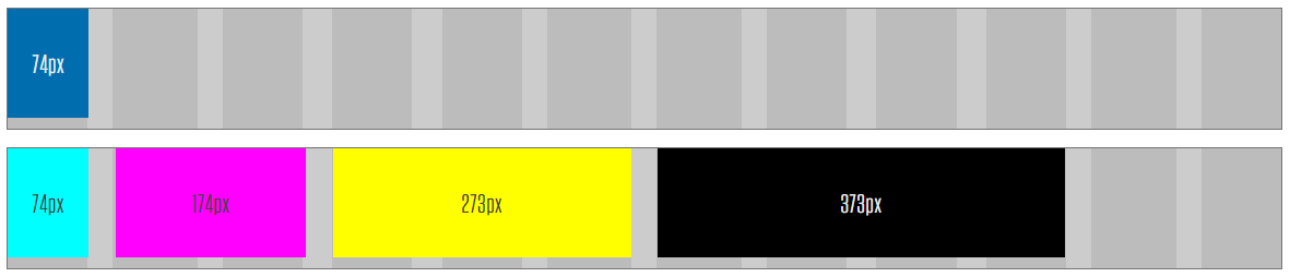
  @include add-grid(12); @include add-gutter(1/3);
  .item    { @include grid-span(1,1); }
  .cyan    { @include grid-span(1,1); }  .magenta { @include grid-span(2,2); }
  .yellow  { @include grid-span(3,4); }  .black   { @include grid-span(4,7); }
Look at the Selectors
  .item    { @include grid-span(1,1); }
  .cyan    { @include grid-span(1,1); }  .magenta { @include grid-span(2,2); }
  .yellow  { @include grid-span(3,4); }  .black   { @include grid-span(4,7); }
Grid code added to CSS selector (class, element, nth-child, etc.) you're already using. → Lean Markup. Legible. Maintainable. Much easier in Drupal.
No More Terrible Class Names!

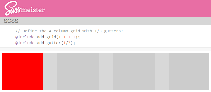
Symmetric Grids
Escaping the 12-column menace: Change the add-grid() argument.
Couldn’t do tenths, sevenths, or fifths before, now could ya?
Symmetric Grids
  @include add-grid(X);       // X equal columns
  @include add-gutter(1/3);   // Intercolumn space: 1/3 the width of one column.
Another Way
Singularity has two basic ways
to specify the number of columns.
add-grid() can take a list instead
You’ve seen a single integer:
@include add-grid(4); // 4 equal columnsYou can also write that this way:
@include add-grid(1 1 1 1); // 4 equal columnsAnd what might happen if we changed a 1 to 2?
Asymmetric Grids
Columns of varying widths
Woah

But why?
I could not make myself think this way. At first.
I stuck to my comfy 12-column grid system without any issue. One day, I needed to change the width of a column. That sucked:
.every-single-element {
  @include grid-span(X,Y); // Manual updates. Is this 6? 8? Or 4? Oops.
}
We use Sass because CTRL-F should not be a dev tool.
A New (Old) Thought Process
It’s not about first, second, ... twelfth column. It’s about:
- The main column and the rail.
- The side-by-side with the sidebar.
- The left nav, the article, and the sidebar with filters and ads.
- That stupid four column mega menu you tried to talk them out of.
Do those words sound familiar?

They should. Those are words the designers are using.
Create Grids for your Content
Don’t cram them into prefab fractions
  // Not real code:
  @include add-grid( LeftNav BodyArea RightRail );

  // Real code:
  @include add-grid( 2 4 1 );

  // Another possibility:
  @include add-grid( 2 4 300px ); // * See below.
* You could even use
Singularity Extras and the Calc output method
to specify that right rail in pixels, like ad dimensions.
Example on SassMeister.
An Example

Meet Aunt Flossie
She’s a Pit Boss in Vegas.
Her Résumé
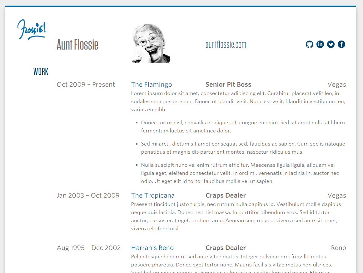
What could be more tabular and
grid-centric than a résumé?
So let’s build one.
The Grid Setup
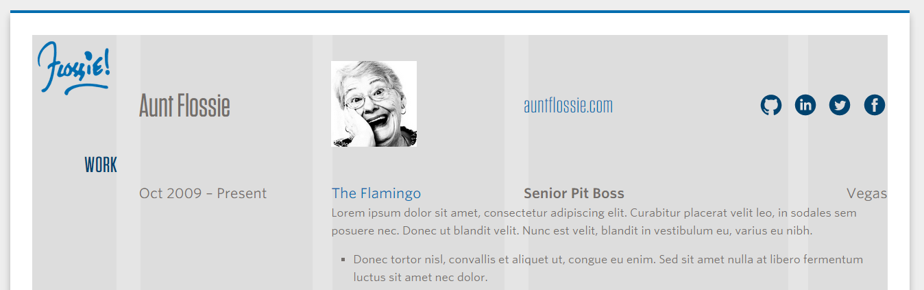
@include add-grid(1 2 2 3 1);
@include add-gutter(1/4);
But wait!
Should this résumé be responsive?
Duh.
Susy Grids users
probably think they’ve got this figured out…
-
Wide:
@include grid-span(6, 7);
(or whatever) -
Narrow:
@include grid-span(12, 1);
(or justwidth:100%;)
Nope. (This is a Susy 1.x example.)
Different Grids at Different Sizes
Desktop-only:
@include add-grid(1 2 2 3 1);


@include add-gutter(1/4);
Grids that grow and change:
@include add-grid(2);
@include add-grid(1 2 2 at 850px);
@include add-grid(1 2 2 3 1 at 1000px);
@include add-gutter(1/8);
@include add-gutter(1/4 at 850px);Look again
with the Background Grid in place
You know kung fu.

And this was designed to work with Breakpoint
@include add-grid(2);
@include add-grid(1 2 2 at 850px);
@include add-grid(1 2 2 3 1 at 1000px);

h2 {
  text-align: center;
  @include breakpoint(850px)  { @include grid-span(1,1); text-align: right; }
  @include breakpoint(1000px) { @include grid-span(1,1); /* * */            }
}
* It’s still (1,1), but it’s a new context.
¡Ojo!
Just having multiple grids defined isn’t enough.
You need to call @include grid-span()
inside a @include breakpoint() to
trigger the new layout.
Did you notice the order?
Example on SassMeister | Singularity’s Isolation output style (default) lets you do this.
Source Order ≠ Visual Order
Just change the add-grid() arguments to re-order any
elements within a single row. Get clever with your
clear:x; statements for even more flexibility.
How does Isolation work?
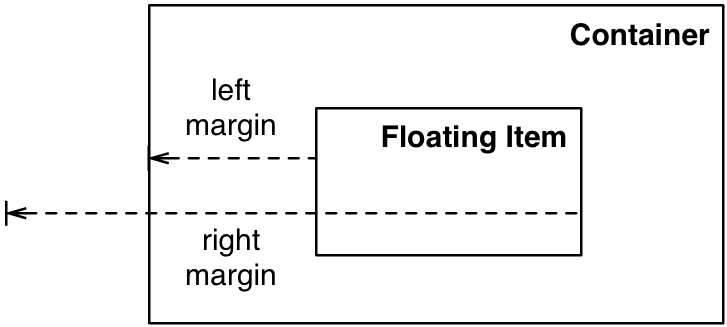
Palantir's John Albin Wilkins explains this layout technique. Rounding inconsistencies could cause broken floated layouts. A negative right margin allows "each adjacent float to no longer sees the right edge of its siblings; it only sees the left inner edge of the container." Thanks, John!
That’s how we did this
Combine multiple grids, breakpoints, and visual re-ordering.

Hint: watch the date (source-first) and the city (source-last).
Also this

Hint: watch the portrait.
Powerful relief

Check it out
Drupal?
Singularity is just CSS. It's easy to use with Drupal.
At Four Kitchens, we use Aurora and Fences for leaner markup, then:
- A Panels layout can be a container with pane regions as grid items.
- A View can be a container with each
.views-rowas a grid item (great with:nth-child()selectors). page.tpl.phpcan be a container with block regions as a grid item.- A multivalue field wrapper can be a container with each individual field value as a grid item.
- Remember that grids can be nested and overridden to build more structure inside by using
@include layout().
Wrapping Up
Singularity is:
- A new kind of grid system which lets you write grids to your content.
- Columns can be equal width (“Symmetric”) or varied in width (“Asymmetric”).
Singularity plays nicely with Breakpoint so that:
- You can have different column layouts at different sizes.
- Your “visual” order doesn’t have to match your “source” order.
Thank You
Slides and Examples on Github:
tsmith512.github.io/intro-to-singularity
tsmith512 on
Github,
Twitter,
LinkedIn,
Drupal.org,
Instagram, and
sometimes seen at Four Kitchens.